We have been providing end-to-end Agility consultancy services to organizations in Turkey and and worldwide since 2007. With experience acquired from more than 750 organizations and 20,000 professionals, we inspire Agile transformations for both organizations and individuals. Our well-experienced team works towards a better world by spreading the benefits of Agile.
CEO Aykut Özüner and HR Director Osman Özdemir tell the Agile Transformation story of Türk Traktör, which we believe will inspire many companies from different industries, especially the automotive industry.
Agility Brings About Substantial Benefits
+20-30%
Employee Engagement
+30-50%
Operational Performance
+10-30%
Customer Satisfaction
Financial Performance 20-30% improvement in
Source: Scrum.org and McKinsey Study, 2020
What is Organizational Agility
Organizational Agility is the ability of an organization to adapt to new conditions and change direction. The aim of Agile Transformation is to create an Agile organization that is compatible with company strategies, quick adaptation, continuous learning, and constant value-creation.
The Agile Transformation Approach
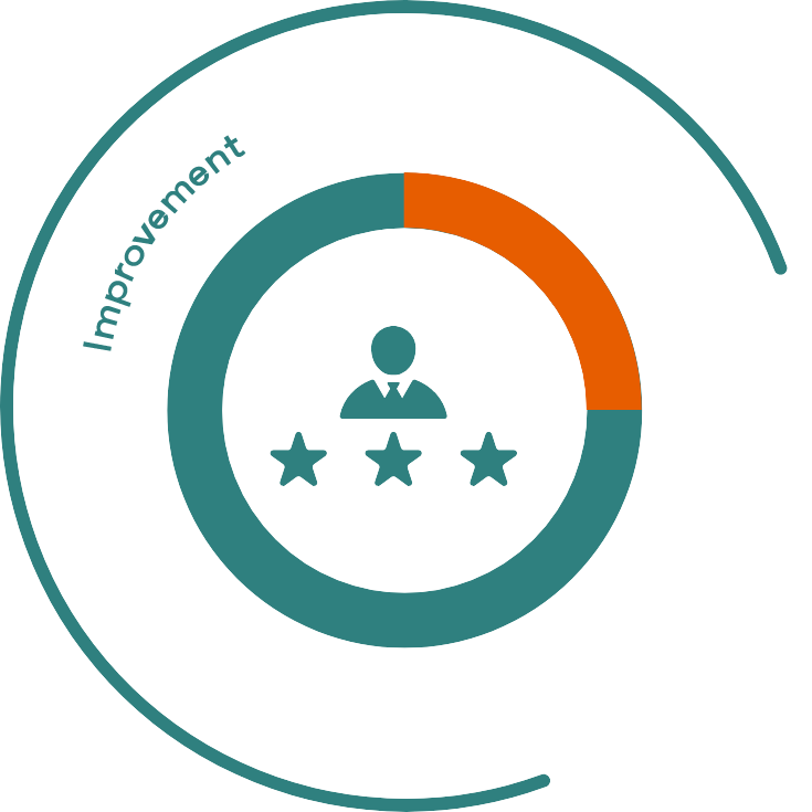
Maintain Balance with Stability
In our experience over the course of the past 16 years, maintaining the financial and operational stability of organizations during Agile transformation strengthens trust in the process and encourages leaders to take calculated risks in order to evolve the business. We believe in introducing empirical approaches as a means to strengthen organizational well-being.
Continuing operations without disrupting value delivery
Enabling transparency for organizational engagement
Harmonizing company culture with Agile
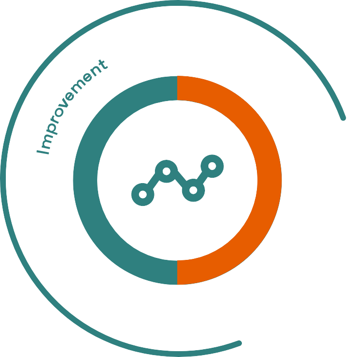
Co-create the Transformation Journey
Unlike large scale top-down change initiatives, Agile transformation can best be described as a “journey” during which the way of working, organizational structure, governance, practices, behaviors, mindset, and eventually culture, is reshaped. Therefore, “top-down” should converge with “bottom-up,” involving and engaging individuals. Together, every transforming organization co-creates itself and writes its own story.
Bottom-up & top-down involvement
No “One-size-fits-all" approach
Thinking big, starting small, learning fast with co-creation
Delivering and showcasing quick-wins for engagement
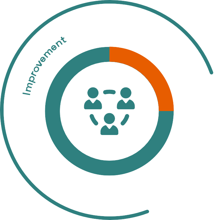
Become Autonomous & Nimble
Agility is the ability of an organization to adapt to new conditions and change its direction to create new business opportunities. For us, success during an Agile transformation involves the organization’s inherent capability to sustain its momentum when the Agile consultancy company steps out. As ACM, we aim to transfer know-how and develop internal change agents as quickly as possible.
Establishing the foundation for a self-sustaining transformation
Developing change agents
Increasing ownership for a new way of working
Establishing a Kaizen culture
ACM Agile Solutions
Agile Transformation
Agile transformation aims to improve the ability of organizations to adapt and react quickly to change so that they can produce higher value output.
In addition to internationally certified training, we provide ACM Training (in cooperation with Scrum.org, Kanban University, Scaled Agile, and ICAgile) backed by 16 years of experience; our training is designed to provide depth of knowledge in the Agile field.
Agile transformation starts with leaders. It is of great importance that these leaders (who play the most critical role in the transformation) internalize Agility so that their perspectives and behaviors model a complete understanding and adoption of the transformation.
Agility CheckUp™ is an evaluation study developed to support the development of teams and to measure teams’ maturity in terms of implementing Agile practices and processes. The purpose of this evaluation is not to supervise teams but to enable them to review their own processes and identify areas of improvement.
Agile Professional Growth Programs
Agile Professional Growth Programs: The Agile Coach helps participants develop their competencies in roles that require depth (such as Product Owner and Scrum Master) and increases agility in their organizations and teams by employing various Agile practices.
ACM Agile consultants specialize in different sectors and support the spread of Agile by sharing the Agile perspective, the achievements of Agile organizations, the transformation process, and the experiences they have gained over the years at various events.
“We are one of the most established Agile consulting companies in Europe with our nearly 30 experienced consultants and 16 years of history.”
Why ACM?
“We aim to spread this culture by providing services in the Agile field to organizations in more than 15 countries around the world.”
Why ACM?
“Since 2007, the year we were founded, we have been working exclusively in Agile, providing customized end-to-end consultancy services.”
Why ACM?
“We share the experience we have gained from more than 750 organizations and more than 20.000 professionals that we have served so far with our business partners.”
Why ACM?
“We are the Turkish partner of organizations such as Scrum.org, Kanban University, IC Agile, Agile Alliance, Business Agility Institute, which are pioneers in Agile in the world.”
Why ACM?
“We support and contribute to the development of many Agile organizations, especially Agile Turkey, in Turkey and the region.”
Why ACM?
“We offer quality-oriented services by combining the experience of our experts with our experience in Agile transformation projects implemented in many different sectors such as Banking, Insurance, Pharmaceuticals, FMCG, Automotive, Telecommunication, E-commerce.”
Why Individual Agility?
Agility starts at the individual level. In this technology era consisting of rapid change and improvements, individual Agility is becoming a necessity. As such, the accelerated change of conditions brings about unique opportunities. By being Agile, you can enhance your potential and prepare for such opportunities.
We are with you by the experience we have gained from more than 750 collaborations for 17 years and our consultant who are the most experienced team in Turkey and its region.
As ACM Agile, we cooperate with many world-leading organizations in their field. In addition to the internationally certified training and programs provided in cooperation with Scrum.org, Kanban University, Scaled Agile and ICAgile, ACM Training and Programs we have designed with 17 years of experience; In the company of experienced Agile consultants, it is waiting for you to develop your competencies in the Agile field.
Yes, I would like to contact experienced consultants in the sector I have chosen.
Subscribe to Newsletter
SEARCH
Personal Data Protection Law Text
ACM AGİLE İNTERNET SİTESİ KVK BİLGİLENDİRME METNİ
ACM Agile Danışmanlık Anonim Şirketi (“ACM Agile” veya “Şirketimiz”) olarak, “https://www.acmagile.com” (“Sitemiz”) adresini ziyaret ettiğiniz takdirde siz internet sitesi ziyaretçilerimize ait kişisel verilerin 6698 sayılı Kişisel Verilerin Korunması Kanunu (“KVKK”) ve ikincil düzenlemelerine uygun olarak işlenmesi ve korunması için azami hassasiyeti göstermekteyiz.
Şirketimiz’in KVKK’dan doğan aydınlatma yükümlülüğü kapsamında siz ziyaretçilerimizi işbu ACM Agile İnternet Sitesi KVK Bilgilendirme Metni (“Bilgilendirme Metni”) aracılığıyla bilgilendirmek isteriz.
Kişisel verilerinizi hangi amaçlarla ve hangi yollarla elde ediyor ve işliyoruz?
Şirketimiz, “https://www.acmagile.com” adresini ziyaret etmenizle birlikte kişisel veri niteliğindeki trafik verilerinizi işlemeye başlamaktadır. Aşağıda belirttiğimiz diğer kişisel verileriniz yine aşağıda açıklanan amaçlarla bağlantılı, sınırlı ve ölçülü bir şekilde elektronik ve fiziki ortamlarda yazılı olarak, otomatik ve otomatik olmayan yöntemlerle KVKK’ya uygun olarak ACM Agile tarafından işlenmektedir.
Kişisel Veriniz
Şirketimize Ulaştığı Ortam
İşleme Amacımız/Amaçlarımız
Trafik verisi
https://www.acmagile.com
5651 sayılı İnternet Ortamında Yapılan Yayınların Düzenlenmesi ve Bu Yayınlar Yoluyla İşlenen Suçlarla Mücadele Edilmesi Hakkında Kanun ve ikincil düzenlemelerinden doğan yükümlülüklerimizi yerine getirmek.
Adınız, soyadınız, e-posta adresiniz, telefon numaranız ve mesajınız içeriğinde paylaşılan kişisel bilgileriniz
https://www.acmagile.com/iletisim
Ürün ve hizmetlerimize ilişkin talep, şikâyet, soru ve önerilerinize cevap verebilmek, ACM Agile ürün ve hizmetlerini tanıtmak, ACM Agile markası tanınırlığını artırmak ve ürün ve hizmetlerimize ilişkin olarak entegrasyon süreçlerini yürütmek.
Adınız, soyadınız, e-posta adresiniz, telefon numaranız, şirket adınız, şirketteki pozisyonunuz, ACM Agile internet sitesi üyelik şifreniz
https://www.acmagile.com/kayit
Agile danışmanlarımız tarafından yazılan blog yazılarına erişim sağlamak, yorum yapmak, yazarlarımız ile iletişime geçmek ve kendi içeriklerinizi oluşturabilmek için ACM Agile internet sitesi üyeliğinizi oluşturmak.
Adınız, soyadınız, e-posta adresiniz ve e-posta içeriğinde paylaşılan kişisel bilgileriniz, telefon numaranız, şirket adınız, şirketteki pozisyonunuz, ACM Agile’ı nereden duydunuz?
https://www.acmagile.com/egitimler
Eğitim kaydınızı oluşturmak, ürün ve hizmetlerimize ilişkin talep, şikâyet, soru ve önerilerinize cevap verebilmek, ACM Agile ürün ve hizmetlerini tanıtmak, ACM Agile markası tanınırlığını artırmak ve ürün ve hizmetlerimize ilişkin olarak entegrasyon süreçlerini yürütmek.
Adınız, soyadınız, e-posta adresiniz ve mesajınız içeriğinde paylaşılan kişisel bilgileriniz
https://www.acmagile.com/uzmanlarimiz
Ürün ve hizmetlerimize ilişkin talep, şikâyet, soru ve önerilerinize cevap verebilmek ACM Agile ürün ve hizmetlerini tanıtmak, ACM Agile markası tanınırlığını artırmak ve ürün ve hizmetlerimize ilişkin olarak entegrasyon süreçlerini yürütmek.
Ürün ve hizmetlerimize ilişkin talep, şikâyet, soru ve önerilerinize cevap verebilmek, ACM Agile ürün ve hizmetlerini tanıtmak, ACM Agile markası tanınırlığını artırmak.
Ad, soyadı, e-posta adresi, şirket bilgisi ve unvan
https://www.acmagile.com
ACM Agile E-Bülten üyeliğinizi gerçekleştirmek.
Ad, soyadı, e-posta adresi
Bize görüşlerinizi bildirin
Kişisel verileriniz hangi hukuki sebebe dayanarak işlenmektedir?
Kişisel verileriniz, başta 6102 sayılı Türk Ticaret Kanunu, 5651 sayılı İnternet Ortamında Yapılan Yayınların Düzenlenmesi ve Bu Yayınlar Yoluyla İşlenen Suçlarla Mücadele Edilmesi Hakkında Kanun ve diğer mevzuatın gereklilikleri olmak üzere ilgili diğer kanun maddeleri doğrultusunda ve KVKK’nın 5. Maddesi 2. Fıkrasında yer alan aşağıdaki hukuki sebepler çerçevesinde işlenmektedir:
kanunlarda açıkça öngörülmesi,
sözleşmenin taraflarına ait kişisel verilerin işlenmesinin gerekli olması,
hukuki yükümlülüklerimizin yerine getirilebilmesi için zorunlu olması,
ilgili kişi tarafından alenileştirilmesi,
bir hakkın tesisi, kullanılması veya korunması için veri işlemenin zorunlu olması,
ilgili kişinin temel hak ve özgürlüklerine zarar vermemek kaydıyla,veri sorumlusu olan Şirketimiz’in meşru menfaatleri için veri işlemenin zorunlu olması
Kişisel verileriniz kimlerle, hangi amaçlarla paylaşılmaktadır?
İşbu Bilgilendirme Metni’nde sayılan kişisel verileriniz, yine bu metinde belirtilen amaçların yanı sıra Şirketimiz’in ticari ve iş faaliyetlerinin yürütülebilmesi amacıyla bağlantılı, sınırlı ve ölçülü olarak dış hizmet sağlayıcıları (IT uzmanları, veri tabanı sağlayıcıları, internet sitesi ve reklam ajansları, yedekleme ve kurtarma uzmanları vb.) ile KVKK’ya uygun olarak paylaşılmaktadır.
Kişisel verilerinizi paylaştığımız üçüncü kişiler KVKK’da aksi öngörülmedikçe paylaşım amacıyla bağlı ve sınırlı olarak kişisel verilerinizi işlemek ve korumakla sözleşme ilişkimiz kapsamında yükümlü olup bu husus ACM Agile’ın denetimindedir.
Kişisel verilerinizi son olarak hukuki sorumluluk ve yükümlülüklerimizi yerine getirmek amacıyla resmi kurum ve kuruluşlar ve yargı makamları ile KVKK’ya uygun olarak paylaşmaktayız.
Kişisel verileriniz yurtdışına aktarılıyor mu?
Şirketimiz’e elektronik posta aracılığıyla ile ulaşmanız durumunda, Şirketimiz kişisel verilerinizi iş sürekliliğinin sağlanması ve sizinle iletişime geçebilmek amaçlarıyla açık rızanız dahilinde yurtdışında mukim hizmet sağlayıcısına (Gmail) aktarmaktadır.
Şirketimiz, kurumsal müşteri olma başvurunuz esnasında veya eğitim katılımcısı olma başvurunuz esanasında toplamış olduğu kişisel verilerinizi, müşteri/eğitim katılımcısı olma başvuru sürecinizin yürütülebilmesi, denetim ve etik faaliyetlerinin yürütülmesi, finans ve muhasebe işlerinin yürütülmesi, iş faaliyetlerinin yürütülmesi ve raporlama işlemlerinin gerçekleştirilebilmesi ile sözleşmesel ilişki kapsamında siz müşterilerimize/eğitim katılımcılarımıza hizmet teminini sağlamak amacıyla açık rızanız dahilinde ACM Agile’ın yurt dışında mukim dış hizmet sağlayıcılarına aktarmaktadır.
Kişisel verilerinizin güvenliği, muhafazası ve imhası
ACM Agile, kişisel verilerinize yetkisiz kişiler tarafından erişilmesini, kişisel verilerinizin hatalı işlenmesini, ifşa edilmesini, hukuka uygun olmayan sebeplerle değiştirilmesini/silinmesini önlemek, verilerinizin korunmasını ve güvenliğini sağlamak amacıyla KVKK uyarınca gerekli tüm teknik ve idari tedbirleri alır.
Kişisel verileriniz, yukarıda belirtilen işleme amaçları için gerekli olan süre ve her halükarda yasal düzenlemelerde belirtilen kanuni zaman aşımı süreleri (azami 10 yıl) boyunca muhafaza edilmektedir. Anılan sürelerin sona ermesi halinde ACM Agile, Kişisel Veri Saklama ve İmha Politikası doğrultusunda kişisel verilerinizi siler, yok eder veya anonim hale getirir.
ACM Agile’ın sistemlerine yapılan saldırılar sonucunda kişisel verilerinizin zarar görmesi ve/veya üçüncü kişiler tarafından ele geçirilmesi/ifşası durumunda, ACM Agile sizleri ve Kişisel Verileri Koruma Kurulu’nu derhal bilgilendirir.
Bilgi Edinme Hakkınız
KVKK’nın 11. maddesi kapsamında, Şirketimiz’e başvurarak kişisel verilerinizin; (i) işlenip işlenmediğini öğrenme, (ii) işlenmişse buna ilişkin bilgi talep etme, işlenme amacını ve amacına uygun kullanılıp kullanılmadığını öğrenme, (iii) yurt içinde/yurt dışında aktarıldığı 3. kişileri bilme, eksik/yanlış işlenmişse düzeltilmesini isteme, (iv) KVKK’nın 7. maddesinde öngörülen şartlar çerçevesinde silinmesini/yok edilmesini isteme, (v) kişisel verilerinizin KVKK’nın 7. maddesi kapsamında silinmesi ve yok edilmesi ve eksik/yanlış işlenmiş kişisel verilerinin düzeltilmesi taleplerinin, kişisel verilerin aktarıldığı üçüncü kişilere bildirilmesini isteme, (vi) münhasıran otomatik sistemler ile analiz edilmesi nedeniyle aleyhinize bir sonucun ortaya çıkmasına itiraz etme, (vii) kanuna aykırı olarak işlenmesi sebebiyle zarara uğramanız hâlinde zararın giderilmesini talep etme haklarına sahip olduğunuzu bildiririz.
Bilgi Edinme Formunu Şirketimiz KVK Yetkilisinden temin edebilirsiniz. İşbu Bilgilendirme Metni kapsamında, kişisel verilerinizin işlenmesine ilişkin herhangi bir sorunuz ya da talebiniz olması halinde lütfen KVK Yetkilisi ile irtibata geçiniz.
İşbu Bilgilendirme Metni, değişen süreçlerimiz dolayısıyla KVKK’ya uyum sağlamak amacıyla güncellenebilecektir. Gerçekleşebilecek güncellemeler için internet sitemizi ziyaret etmenizi rica ederiz.
ACM Agile Danışmanlık Anonim Şirketi
Commercial Electronic Message Text
PRIVACY NOTICE FOR MEMBERSHIP
Pursuant to this Privacy Notice, we aim to inform the website members about the personal data processing activities conducted by our company; ACM Agile.
Who We Are
As ACM Agile (“Company” or “Our Company” or “ACM Agile” or “We”) the utmost diligence is shown in accordance with the principles defined in the European Union’s General Data Protection Regulation (“GDPR”) and its secondary legislation (“GDPR Legislation”) when processing and protecting the personal data of our website members.
What Data Do We Collect
Your name/surname, e-mail address, job title, company name and country name are processed in accordance with the GDPR Legislation.
Methods of Obtaining Personal Data, Processing Purpose and Methods
Your personal data is procured electronically, in compliance with the GDPR Legislation, through the Membership Form, at the moment of website registration process directly by you. The processing of data relies on the legal ground listed within the GDPR Legislation.
The abovementioned personal data is processed by Our Company in connection with contractual obligation and legitimate interest, in a limited and measured manner, in virtual platforms, automatically or manually to, create your membership, communicate with you, getting your opinions and thoughts, carrying out our corporate communication processes, managing the complaints and requests filed with the Company, in accordance with the GDPR Legislation.
Our company will not process your personal data without your explicit consent, except for the reasons stated above.
Sharing of Personal Data
Your personal data listed in this Privacy Notice is shared with in a written electronic format, automatically, the following parties/entities to perform the functions listed under to get your feedbacks through this Form, to communicate with you, conduct commercial activities and operations, to perform legal obligations and duties while being strictly bound by the 5th and 9th Articles of the GDPR, only with our service providers.
The persons listed are obligated to process, store, and protect your personal data, which forms the foundational relationship between them and Our Company, in a limited and measured manner and in compliance with the relevant GDPR provisions, and the processing done towards your personal data is under the supervision of ACM Agile.
Protection of Personal Data
Our Company takes the necessary technical and administrative precautions in accordance with the GDPR to ensure the prevention, protection, and security of the access to your personal data by unauthorized persons, erroneous processing of your personal data, disclosure of your personal data, and prevention of the erasure/editing of this data in an unlawful manner.
Your personal data is housed in electronic medium in accordance with the purpose listed above, authorized persons will have access to the company database and the relevant person’s email accounts.
In line with data protection principles, we only keep your data for as long as we need it for, which will be at least for the duration of your membership.
Your personal data is erased, destructed, or anonymized in compliance with the provisions of the GDPR and in accordance with the details described in Our Company’s Procedure for the Protection and Privacy of Personal Data and the Retention and Destruction of Personal Data.
In cases where your personal data is damaged due to a hostile attack against the physical archives and/or the servers and/or other systems of ACM Agile, or access/disclosure is gained by third parties, Our Company shall notify the relevant authorities in accordance with Article 55 of the GDPR, including the competent and authorized personal data protection authority, in accordance with Article 33 of the GDPR detailing breach notification rules.
Right to be Informed
In accordance with the relevant provisions detailed in Article 13 and 14 of the GDPR, the right to be informed can be initiated by the data subject and/or user by contacting Our Company of purposes of:
Your right of access - You have the right to ask us for copies of your personal information.
Your right to rectification - You have the right to ask us to rectify personal information you think is inaccurate. You also have the right to ask us to complete information you think is incomplete.
Your right to erasure - You have the right to ask us to erase your personal information in certain circumstances.
Your right to restriction of processing - You have the right to ask us to restrict the processing of your personal information in certain circumstances.
Your right to object to processing - You have the the right to object to the processing of your personal information in certain circumstances.
Your right to data portability - You have the right to ask that we transfer the personal information you gave us to another organisation, or to you, in certain circumstances.
You are not required to pay any charge for exercising your rights. If you make a request, we have one month to respond to you.
If you have any concerns about our use of your personal information, you can make a complaint to us at hande.aslan@acmagile.com.
We may update this Privacy Notice from time to time to reflect changes in our practices or for legal reasons. Any updates will be posted on our website, and we recommend checking it periodically.
ACM Agile Danışmanlık Anonim Şirketi (“Şirketimiz” veya “ACM Agile”) olarak siz ACM Agile E-Bülten üyelerimize ait kişisel verilerin 6698 sayılı Kişisel Verilerin Korunması Kanunu (“KVKK”) ve ikincil düzenlemelerine uygun olarak işlenmesi ve korunması için azami hassasiyeti göstermekteyiz.
İşbu ACM Agile E-Bülten Üyelerine İlişkin Aydınlatma Beyanı (“Aydınlatma Beyanı”) ile birlikte Şirketimiz’in ACM Agile E-Bülten üyelerine ilişkin olarak gerçekleştirdiği kişisel veri işleme faaliyetleri hakkında sizleri bilgilendirmek amaçlanmaktadır.
Şirketimiz Tarafından İşlenen Kişisel Verileriniz
ACM Agile tarafından, adınız, soyadınız ve e-posta adresiniz KVKK’ya uygun olarak işlenmektedir.
Kişisel Verilerinizi Elde Etme Yolları, İşleme Amaçları ve Yöntemleri
Kişisel verileriniz, Şirketimiz internet sitesi üzerinden ACM Agile Bülten’e Kayıt Ol sayfası aracılığıyla doğrudan siz e-bülten üyelerimizden KVKK’ya uygun olarak elde edilmektedir.
Söz konusu kişisel verilerinize ilişkin olarak ACM Agile’ın veri işleme amaçları ve hukuki sebepleri aşağıda yer alan tabloda bilgilerinize sunulmuştur:
Kişisel Veri
İşleme Amacı
Hukuki Sebebi
Ad/Soyadı
Siz E-Bülten üyelerimize hitap edilebilmesi, istek, talep ve şikâyet süreçlerinin yönetimi.
KVKK Md. 5/2 (f), veri sorumlusunun meşru menfaati.
E-posta
E-Bülten gönderimini ve açık rızanız dahilinde ACM Agile adına diğer ticari elektronik iletilerin iletilmesi, Şirketimiz’in ticari faaliyetleri doğrultusunda mal ve hizmetlerini tanıtmak ve ACM Agile markası tanınırlığını artırmak, pazarlama ve reklam çalışmalarının yürütülmesi, kurumsal iletişim süreçlerinin yönetilmesi.
KVKK Md. 5/2 (f), veri sorumlusunun meşru menfaati.
ACM Agile yukarıda belirtilen kişisel verilerinizi, ilgili amaçlarla ve bağlantılı, sınırlı ve ölçülü bir şekilde elektronik ortamlarda otomatik yöntemlerle KVKK’ya uygun olarak işlemekteyiz.
Kişisel Verilerinizin Üçüncü Kişilerle Paylaşılması
Şirketimiz ile doğrudan ya da üçüncü kişiler aracılığı ile dolaylı olarak paylaştığınız kişisel verileriniz, Şirketimiz’in organizasyon ve yönetişim yapısı gereği ve ticari faaliyetlerinin ve operasyonlarının yürütülmesi, hizmet verebilmesi, hizmet alabilmesi, iş birliği kurabilmesi, resmi işlerini yürütebilmesi, akdettiği sözleşmeleri ifa edebilmesi, siz e-bülten üyelerimize bültenin gönderimini sağlamak ve ilgili yasal düzenlemelerden doğan sorumluluk ve yükümlülüklerini yerine getirebilmesi amaçları ve 6698 sayılı Kişisel Verilerin Korunması Kanunu’nun 5. ve 6. maddelerinde belirtilen diğer hukuka uygunluk sebepleri ile bağlı, sınırlı ve ölçülü bir şekilde dış hizmet sağlayıcılarımız ile elektronik veya fiziki ortamlarda yazılı olarak, otomatik ya da otomatik olmayan yöntemlerle KVKK’ya uygun olarak paylaşılmaktadır.
Kişisel verilerinizi paylaştığımız üçüncü kişiler KVKK’da aksi öngörülmedikçe paylaşım amacıyla bağlı ve sınırlı olarak kişisel verilerinizi işlemek ve korumakla sözleşme ilişkimiz kapsamında yükümlü olup ACM Agile’ın denetimindedir. Kişisel verilerinizi son olarak hukuki sorumluluk ve yükümlülüklerimizi yerine getirmek amacıyla resmi kurum ve kuruluşlar ve yargı makamları ile KVKK’ya uygun olarak paylaşmaktayız.
Kişisel Verilerinizin Yurt Dışına Aktarımı
Şirketimiz, siz ACM Agile E-Bülten üyelerimize ait kişisel verilerinizi ACM Agile E-Bülten ve diğer ticari elektronik iletilerin gönderilmesi işlemlerinin gerçekleştirilebilmesi ve iş faaliyetlerinin yürütülmesi amaçlarıyla açık rızanız dahilinde ACM Agile’ın dış hizmet sağlayıcılarına (Drive, Inbox, Next4biz) aktarmaktadır.
Şirketimiz’e elektronik posta aracılığıyla ile ulaşmanız durumunda, Şirketimiz kişisel verilerinizi iş sürekliliğinin sağlanması ve sizinle iletişime geçebilmek amaçlarıyla açık rızanız dahilinde yurt dışında mukim üçüncü kişilere (Gmail) aktarmaktadır.
Şirketimiz, toplamış olduğu kişisel verilerinizi yukarıda yer alan alıcı grupları haricinde yurt dışında mukim herhangi bir üçüncü kişiye aktarmamaktadır.
Kişisel Verilerinizin Korunması, Muhafazası ve İmhası
Şirketimiz, kişisel veri güvenliği ve mahremiyetinin korunması konusunda oldukça yüksek bir farkındalığa sahiptir. Şirketimiz bu doğrultuda sizlere ait kişisel verileri başta KVKK olmak üzere, Şirketimiz’in KVK Prosedürü ile Kişisel Veri Saklama ve İmha Politikası’na uygun şekilde güvenliğini sağlayarak korumakta, muhafaza etmekte ve sonrasında imha etmektedir.
Kişisel verileriniz (i) Elektronik ortamda: ACM Agile’ın E-Bülten ve ticari elektronik iletiler ile ilgili süreçlerini yöneten yetkili kişiler tarafından erişim sağlanan veri tabanı ile yalnızca bu kişilerin ve ilgili departman yetkililerinin e-posta kutularında, (ii) Fiziki ortamda: Yalnızca ACM Agile’ın E-Bülten ve ticari elektronik iletiler ile ilgili süreçlerini yöneten yetkili kişiler tarafından erişim sağlanan kilitli dolaplarda muhafaza edilmektedir.
ACM Agile E-Bülten üyelerimize ait kişisel veriler Pazarlama departmanının dosyasında ve yetkili kişilerin e-posta kutularında, ACM Agile E-Bülten üyeliğinizi sona erdirene kadar ve her hâlükârda yasal düzenlemeler gereği E-Bülten üyeliğinizin sona erme tarihinden itibaren 10 yıl boyunca yukarıda anılan ortamlarda muhafaza edilir.
ACM Agile’ın fiziki arşivine ve/veya sunucularına ve/veya diğer sistemlerine yapılan saldırılar sonucunda kişisel verilerinizin zarar görmesi ve/veya üçüncü kişiler tarafından ele geçirilmesi/ifşası durumunda Şirketimiz sizleri ve Kişisel Verileri Koruma Kurulu’nu derhal bilgilendirir.
Bilgi Edinme Hakkınız
KVKK’nın 11. maddesi kapsamında Şirketimiz’e başvurarak kişisel verilerinizin; (i) işlenip işlenmediğini öğrenme, (ii) işlenmişse buna ilişkin bilgi talep etme, işlenme amacını ve amacına uygun kullanılıp kullanılmadığını öğrenme, (iii) yurt içinde/yurt dışında aktarıldığı 3. kişileri bilme, eksik/yanlış işlenmişse düzeltilmesini isteme, (iv) KVKK’nın 7. maddesinde öngörülen şartlar çerçevesinde silinmesini/yok edilmesini isteme, (v) kişisel verilerinizin KVKK’nın 7. maddesi kapsamında silinmesi ve yok edilmesi ve eksik/yanlış işlenmiş kişisel verilerinin düzeltilmesi taleplerinin, kişisel verilerin aktarıldığı üçüncü kişilere bildirilmesini isteme, (vi) münhasıran otomatik sistemler ile analiz edilmesi nedeniyle aleyhinize bir sonucun ortaya çıkmasına itiraz etme, (vii) kanuna aykırı olarak işlenmesi sebebiyle zarara uğramanız hâlinde zararın giderilmesini talep etme haklarına sahip olduğunuzu bildiririz.
Bilgi edinme formunu Şirketimiz’in KVK Yetkilisinden temin edebilirsiniz.
Hande Santur Aslan
0212 268 78 40
hande.aslan@acmagile.com
İşbu Aydınlatma Beyanı, değişen şartlara ve yasal düzenlemelere uyum sağlamak amacıyla güncellenebilecektir.
Şirketimiz tarafından yapılacak güncellemeler siz ACM Agile E-Bülten üyelerimize bildirilecektir.